When you work as a data analyst or data scientist (I'll use the terms interchangeably) in a company, you may not be training predictive models every single day. A significant (and often interesting) part of your job is answering business questions via data mining regardless if you do it with machine learning, descriptive statistics or whatever. You may start with a business question like:
why are our revenues increasing in the last quarter?
what are common patterns between our loyal customers?
Such simple questions often require a complex work that goes beyond knowing well statistics. You need to know how how your business work and what are the expectations of your stakeholder.
What the analyst enjoys the most (and the least)
Once a business question has arrived, where do we start from? Most data analysts would start mining into the data exploration phase. This phase is usually the first one of the activity, and the data analysts look into distributions and patterns in the data. The goal here is to get a good comprehension of the data we are sitting on. And usually the data analysts has fun during this data exploration time.🎉🙌 He or she is playing with charts and with some statistics from the dataset.
What does the data analyst usually not enjoy doing? 👎😭 Based on my experience, preparing the presentation about the results of the analysis is the part of the activity that most data analysts enjoy the least. And what does it imply?
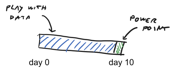
Imagine you have 10 days to work on this data analysis before the meeting with your stakeholders. As our dear data analysts enjoy playing with the data more than playing with PowerPoint, they would probably spend 9 days on mining the data and 1 day working on the presentation. And probably the 9 days do not depend on the actual complexity of the task. If the business question can be answerend in 5 days with some basic descriptive statistics, the data analysts would probably invest more and more time trying some more advanced modelling technique or some more fancy data visualization. Why? Because they enjoy it. So, the data analysis part of the activity fills all the available space like a gas in a room would do.
Last day (if not very last hours) is usually left to working on the presentation.
The wrong interpretation of the role
I was expecting from a data analyst to focus on the data mining, and that looked fine to me. She/he would share the data with other stakeholders (eg marketing staff), and THEY would get the insights because THEY are the domain expert. The data scientist would get the data, would let the data talk, and the business stakeholder would read the insights.
I thought it was OK to present an exploratory analysis. And I was wrong.
Explanatory over exploratory
Recently, I read Storytelling with Data by Cole Nussbaumer Knaflic. The author explains why data scientists should show explanatory analyses (rather than exploratory).
If you are the one analyzing and communicating the data, you likely know it best—you are a subject matter expert. This puts you in a unique position to interpret the data and help lead people to understanding and action.
Once the explorary data mining phase is over, the data analyst should take the time and the effort to interpret the data. She/he should turn the data into information that can answer the need of the audience.
Why is it hard? We often believe that the audience is the subject matter expert and know what is actually the valuable information behind the data. That's why working on the explanatory phase is an uncomfortable zone for a data scientist, but she/he should feel confident in making recommendations and observations.
If we entitle a data analyst to interpret the business insights of the data, there are at least 2 things he/she should take into considerations:
- take enough time to interpret the data
- review the data visualizations to explicitly communicate his/her interpretation
Regarding the 1st point, looking for business insights is surprisingly time consuming. You cannot just dedicate the very last hours of your activity to looking for explanations behind data patterns. We should probably reconsider a classic sequential approach to the activity (eg explore, explain, present) in favor of an approach that organizes our time as to have quick iterations around business hypothesis and repeat multiple iterations before concluding our activity.
Regarding, the 2nd point, I'll go a bit deeper with an example.
Example: review your data viz
You can find of course many examples on Knaflic's book. Let's look at one I picked one from her website. Imagine we're working in a hospital and are analyzing lengths of hospitals stays after a surgery. For each stay of year 2019, we're given
- the quarter of the year
- the length of stay
When a data analysts is done with the first exploratory analysis, what could be the output?
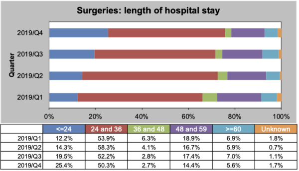
In this chart, data is presented to the audience. However, how easy is it to get valuable information out of it? You may notice some patterns (eg increase in frequency <=24 stays over the year), however finding patterns is hard or requires quite some cognitive effort.
What if the data analyst would take this effort of extracting the information out of the data? How should the presentation be revisited? She/he should be confident in highlighting what's actually valuable in the data and focus the attention on the reader on that.
In this example, the data analyst can make the key information explicit. She/he can find out that the <=24 stays have increased over the year and could know that this is considered a success. Why not emphasizing it on the chart?
Let's look at how an explanatory chart would look like.
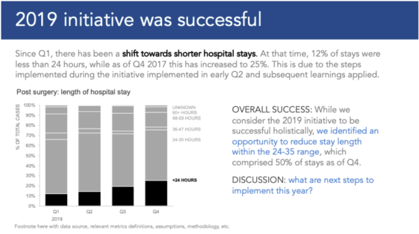
The chart now has a clear message that is stated in the title and is fully described in the text next to the actual plot. The new chart looks clean because any visual component that is not useful to grab the chosen message is either hidden or grayed out. The data analyst in this case has focused on explaining why 2019 was a success rather than showing plain data. That's why the bars of the <=24 stays are highlighted in black, while, in contrast, the remaining bars are grayed out. The choice of colors captures the attention of the reader on the patterns and on the signal, rather than on the data itself.
Looking forward
This article is mainly inspired by Knaflic's book and by my experience on interacting with stakeholders over the last years. I haven't done a research of the literature on the topic, so please consider this article as a set of opinionated recommendations on how a data scientist could maximize his/her impact when working on data mining activities. Agreeing with this approach means that a data scientist should dedicate energies to
- getting a deep knowledge of the business of the company she/he works at and the market where it competes
- fine tuning and improving the data visualizations she/he by iterating over and over on them (not stopping at the default chart styles generated by statistics softwares)
These thoughts do not apply fully to every single company of course. They make sense in teams or companies where data scientists spend a part of their time making data explorations and data mining activities to answer questions that business stakeholders ask them. I would appreciate any feedback or thought you have on it!