I have been working quite some time with charts and business intelligence in the last 5 years. When you spend time building business reports, you may perceive data visualization as a cold technical and business tool. However, there are 6 hidden gems in data visualization that I found by chance. I realized data visualization is not as cold as I thought. Let me recap for you these 6 gems.
1) The first chart ever
William Playfair was a Scottish engineer and political scientist from the 18th century. He is considered as the author of the very first chart:
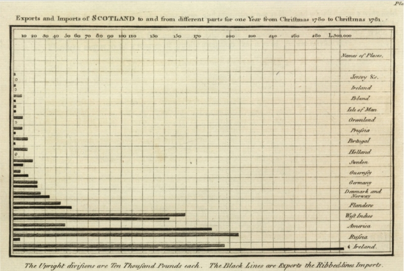
The chart was published back in 1786. It shows the volumes of imports and exports of Scotland over one year on a scale of 10k pounds. Each country is given two bars: one for volume of imports, one for volume of exports.
I am so used to seeing bar charts that I never asked myself who was the inventor or when they first appeared. It's nice to find out that the have been invented way before the invention of calculators and that they have changed so little since then.
2) The best graphic ever
Charles Minard represented 6 types of data about Napoleon's 1812 Russia campaign in one single chart. This visual was considered by Edward Tufte as "the best statistical graphic ever produced".
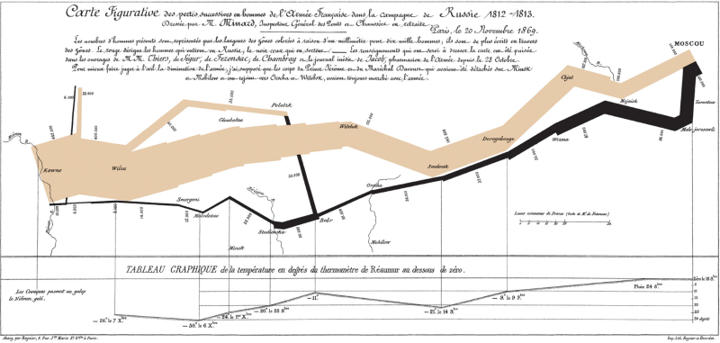
Minard represented in two dimensions six types of data: the number of Napoleon's troops; distance; temperature; the latitude and longitude; direction of travel; and location relative to specific dates.
3) Non-neutrality: the Legarithmic scale
Is data visualization a neutral discipline? Not really. Basic decisions like the choice of scale or of the limit of axes might change radically the information perceived by the reader. Take a look at the following tweet by Matteo Salvini (leader of "Lega" party) about results of a poll on popularity of Italian politicians:
Nonostante menzogne, attacchi e processi, milioni di Italiani credono, sperano, confidano nella Lega.
— Matteo Salvini (@matteosalvinimi) September 11, 2021
Eh già, e siamo ancora qua…
Non si molla mai, GRAZIE! pic.twitter.com/DFMecxPFzC
Do you notice anything wrong with the chart? The y axis looks a bit tweaked. The difference between the axis does not follow any reasonable scale (perhapse a "Legarithmic" scale?) since the difference between the 3 bars is not consistent. Here is how the same data looks when plotted in Excel.
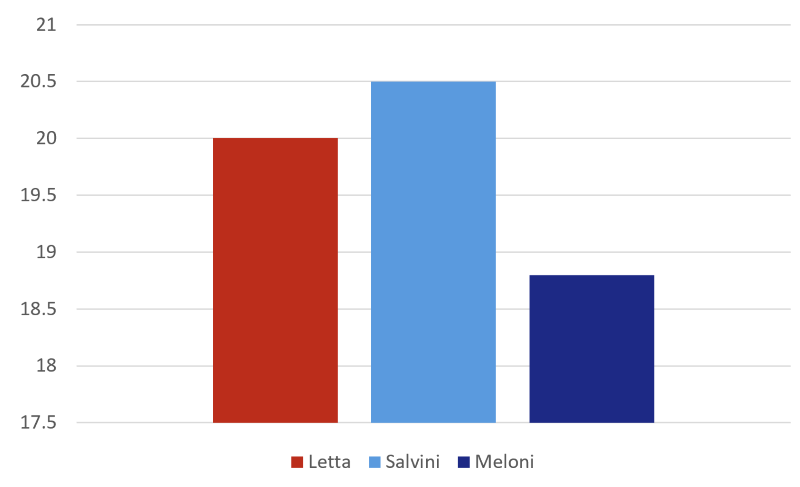
However, the effect on the reader is not the same, isn't it?
4) Beyond shapes: infographics
Otto Neurath was one of the main contributor to the picture language, aka ISOTYPE (International System of Typographic Picture Education). This method consists of replacing classic shapes in data visualization (eg bars, circles, etc) with a set of standardized symbols. Quantities are represented by repeating the same symbol over and over proportionally to the measure. Consider the following example by Otto Neurath from 1930.
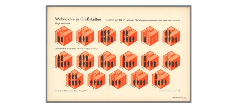
The chart represents the density of population in different cities. The information is represented as the number of persons that would live in a flat of 200 m2. The count of persons is not represented by a digit or by a bar, but it is represented by the repetition of a symbol as many time as the count of persons for that city. The result is effective. Density is no more a number, and you can feel the size of the measure. Infographics can turn cold numbers into tangible perceptions of a phenomenon.
5) Pie charts: bad by definition
"Bad by definition" is the title of one of my favourite blog posts about data visualization. This article is a clean explanation of why you should not use pie charts for most of the use cases. The article starts with this example.
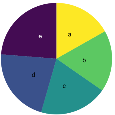
Can you rank the slices of the pie by size? You'd probably struggle a bit trying to answer. The reason is that our brain is not used to measure and compare angles. It's funny to see pie charts being used every now and then in business reports. Most of the times, a basic bar chart would be way more effective to let the user understand the numbers behind. However, it seems that pie charts are now endemic in corporations, and the way is still long before getting rid of it 😁
6) What is data visualization?
Is data visualization a branch of computer science? It turns out that data visualization is broader discipline, and it is part of information design. Information design is the practice of presenting information in a way that fosters an efficient and effective understanding of the information.
Can the same data of a bar chart be represented in plain text? Yes.
Would plain text require us the same effort to understand the information behind the numbers? Probably not.
Would we even be able to get such information from plain text? Probably not because visualizing information helps our brain to perceive what's going on.
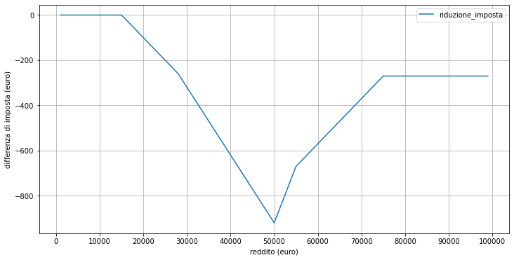
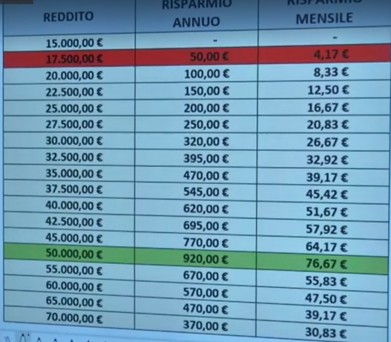
I recently wrote about an article on the impact of information design on journalism. The article starts from a recent tax reform in Italy. Most information media have kept showing tables about the new tax rates, however I found quite hard to get a clear and full picture of the reform. I was not able to find online a single data visualization about the data behind the reform. So, I have done it by myself, and it turned out the article was quite appreciated (with more than 2.3k reads at the time of this writing and plenty of positive feedbacks on social networks).
The reason why the article was so viral is that one single line chart was able to describe the reform way more effectively than the textual tables you could find online. I find this a decent example of "efficient and effective understanding of information" that is the overall goal of information design.
References
This article is a collection of notes I took in the last couple of years. Historical charts are inspired by talks by Paolo Ciuccarelli. The ideas behind the critics to pie charts is inspired by the article of Yan Holtz. Plenty of details are of course from Wikipedia.