This post contains the code that I used in my talk at Python Milano Meetup on June 22nd 2016. The talk was a quick overview of Pipeline, a nice API by scikitlearn to abstract your machine learning algorithm. It is based on the Boston Housing Data Set.
We'll just load the data set from sklearn.
from sklearn.datasets import load_boston
housing_data = load_boston()
print housing_data.DESCR
We might want to make it a Pandas dataframe to make things easier to handle.
import pandas as pd
df = pd.DataFrame(housing_data.data)
df.columns = housing_data.feature_names
df['PRICE'] = housing_data.target
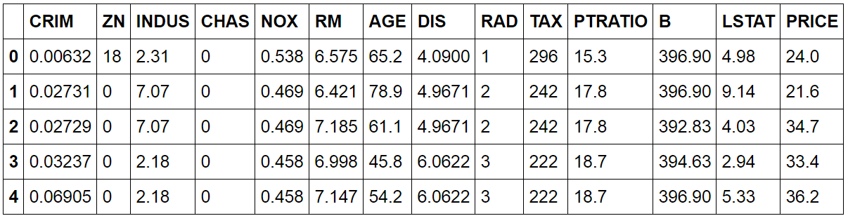
df.head()
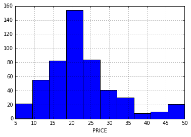
The goal is to predict the PRICE variable given the other features. How does this variable distribute?
import matplotlib.pyplot as plt
df.PRICE.hist()
plt.xlabel('PRICE')
 {.alignnone
.size-full .wp-image-74 width="378" height="271"}
{.alignnone
.size-full .wp-image-74 width="378" height="271"}
Let's turn the dataframe into a ML-friendly notation.
X = df.drop('PRICE', axis=1)
y = df['PRICE']
We will now define the metric that assess the accuracy of our algorithm/pipeline. Let's use the good old cross validation.
from sklearn import cross_validation
def evaluate_model(X, y, algorithm):
print 'Mean Squared Error'
scores = cross_validation.cross_val_score(algorithm, X, y,
scoring='mean_squared_error')
print -scores
print 'Accuracy: %0.2f' % -scores.mean()
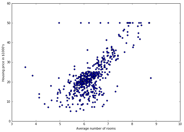
So, now, we can try a bunch of algorithms and see which one works best by calling evaluate_model. It is now time to implement a first algorithm. So, let's explore a bit the data set. Is there any pattern we can exploit?
plt.figure(figsize=(10,7))
plt.scatter(df['RM'], y)
plt.xlabel('Average number of rooms')
plt.ylabel('Housing price in \$1000\'s')
plt.show()
 {.alignnone
.size-full .wp-image-78 width="610" height="438"}
{.alignnone
.size-full .wp-image-78 width="610" height="438"}
As expected, there is a relation between the average number of rooms and the median price. So, let's build the first algorithm.
from sklearn.pipeline import make_pipeline
from sklearn.preprocessing import FunctionTransformer
from sklearn.linear_model import LinearRegression

def just_RM_column(X):
RM_col_index = 5
return X[:, [RM_col_index]]

pipe = make_pipeline(
FunctionTransformer(just_RM_column),
LinearRegression()
)
How well does it perform?
evaluate_model(X, y, pipe)
'''Mean Squared Error [43.19492771 41.72813479 46.89293772] Accuracy:
43.94'''
Can we visualize what the pipeline is actually doing?
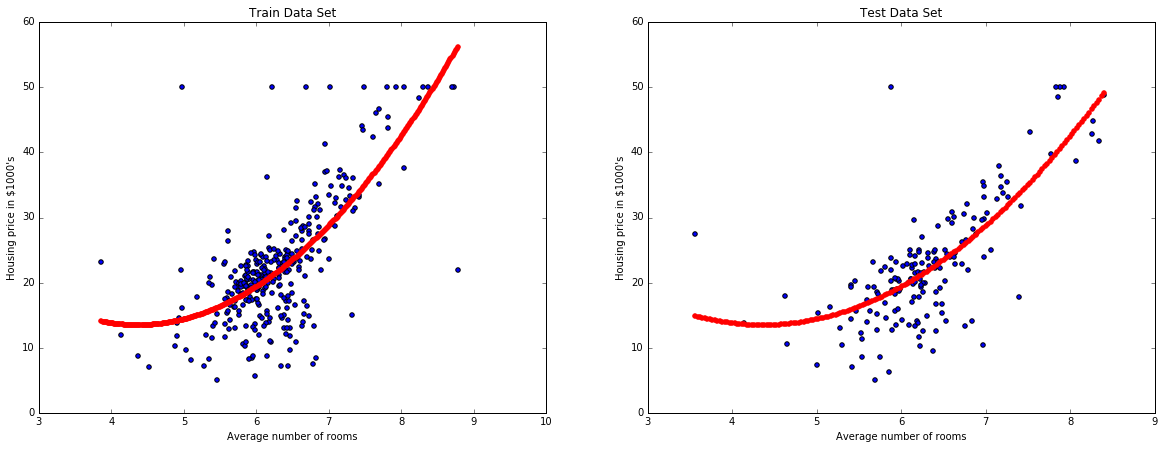
def plot_model_RM(X, y, pipe):
X_train, X_test, y_train, y_test =
cross_validation.train_test_split(
X,
y,
test_size=0.33,
random_state=5
)
pipe.fit(X_train, y_train)
fake_X_train = np.array(X_train)
fake_X_train[:, 5] = np.linspace(min(fake_X_train[:, 5]),
max(fake_X_train[:, 5]), num=len(fake_X_train[:, 5]))
fake_X_test = np.array(X_test)
fake_X_test[:, 5] = np.linspace(min(fake_X_test[:, 5]),
max(fake_X_test[:, 5]), num=len(fake_X_test[:, 5]))
plt.figure(figsize=(20,7))
plt.subplot(1, 2, 1)
plt.scatter(X_train['RM'], y_train)
plt.scatter(fake_X_train[:, 5], pipe.predict(fake_X_train),
color='r')
plt.xlabel('Average number of rooms')
plt.ylabel('Housing price in \$1000\'s')
plt.title('Train Data Set')
plt.subplot(1, 2, 2)
plt.scatter(X_test['RM'], y_test)
plt.scatter(fake_X_test[:, 5], pipe.predict(fake_X_test),
color='r')
plt.xlabel('Average number of rooms')
plt.ylabel('Housing price in \$1000\'s')
plt.title('Test Data Set')
plt.show()

plot_model_RM(X, y, pipe)
 {.alignnone
.size-full .wp-image-84 width="1173" height="449"}
{.alignnone
.size-full .wp-image-84 width="1173" height="449"}
We now do a bit of feature engineering. We square the features.
def add_squared_col(X):
return np.hstack((X, X**2))

pipe = make_pipeline(
FunctionTransformer(just_RM_column),
FunctionTransformer(add_squared_col),
LinearRegression()
)
We evaluate this other pipeline.
evaluate_model(X, y, pipe)
'''
Mean Squared Error
[ 40.31207562 36.75642688 40.75444834]
Accuracy: 39.27'''
And we see how the algorithm is fitting the data set.
plot_model_RM(X, y, pipe)
 {.alignnone
.size-full .wp-image-86 width="1165" height="449"}
We now try a different model like a decision tree.
{.alignnone
.size-full .wp-image-86 width="1165" height="449"}
We now try a different model like a decision tree.
from sklearn.tree import DecisionTreeRegressor

pipe = make_pipeline(
FunctionTransformer(just_RM_column),
FunctionTransformer(add_squared_col),
DecisionTreeRegressor(max_depth=3)
)
evaluate_model(X, y, pipe)
'''
Mean Squared Error
[ 57.28366371 61.5437311 84.32756118]
Accuracy: 67.72
'''
plot_model_RM(X, y, pipe)
 {.alignnone
.size-full .wp-image-87 width="1165" height="449"}
{.alignnone
.size-full .wp-image-87 width="1165" height="449"}
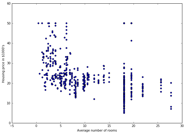
We now explore a second feature: INDUS.
plt.figure(figsize=(10,7))
plt.scatter(df['INDUS'], y)
plt.xlabel('Average number of rooms')
plt.ylabel('Housing price in \$1000\'s')
plt.show()
 {.alignnone
.size-full .wp-image-89 width="610" height="438"}
{.alignnone
.size-full .wp-image-89 width="610" height="438"}
So, we see another relation between INDUS and PRICE. So, let's add this second feature.
def RM_and_INDUS_cols(X):
RM_col_index = 5
INDUS_col_index = 2
return X[:, [RM_col_index, INDUS_col_index]]

pipe = make_pipeline(
FunctionTransformer(RM_and_INDUS_cols),
FunctionTransformer(add_squared_col),
LinearRegression()
)

evaluate_model(X, y, pipe)
'''
Mean Squared Error
[ 32.3420789 31.4260901 35.95835866]
Accuracy: 33.24
'''
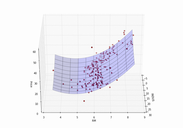
Now, plotting a model in 3D needs a bit more effort.
def plot_model_RM_INDUS(X, y, pipe):
X_train, X_test, y_train, y_test =
cross_validation.train_test_split(
X,
y,
test_size=0.33,
random_state=5
)
pipe.fit(X_train, y_train)
X_test = np.array(X_test)
fig = plt.figure(figsize=(10,7))
ax = p3.Axes3D(fig)
x = X_test[:, 2]
y = X_test[:, 5]
z = y_test
ax.scatter(x, y, z, c='r', marker='o')
x = np.arange(min(x), max(x), (max(x) - min(x)) / 100.0)
y = np.arange(min(y), max(y), (max(y) - min(y)) / 100.0)
X, Y = np.meshgrid(x, y)
Z = np.zeros(X.shape)
fake_X = np.zeros((1, 10))
for i in range(X.shape[0]):
for j in range(X.shape[1]):
fake_X[0, 2] = X[i, j]
fake_X[0, 5] = Y[i, j]
Z[i, j] = pipe.predict(fake_X)[0]
ax.plot_surface(X, Y, Z, alpha=0.2)
ax.set_xlabel('INDUS')
ax.set_ylabel('RM')
ax.set_zlabel('Price')

plot_model_RM_INDUS(X, y, pipe)
 {.alignnone
.size-full .wp-image-91 width="720" height="504"}
{.alignnone
.size-full .wp-image-91 width="720" height="504"}
How pretty is that?
The following step is to use all the features available. So, we move to a 13-dimensional feature vector.
pipe = make_pipeline(
LinearRegression()
)
evaluate_model(X, y, pipe)
'''
Mean Squared Error
[ 20.50009513 22.42870192 27.88911654]
Accuracy: 23.61'''
The error got quite smaller. We cannot however plot the model in 13-dimensions. We will now re-use the function that adds a squared feature.
pipe = make_pipeline(
FunctionTransformer(add_squared_col),
LinearRegression()
)
evaluate_model(X, y, pipe)
'''
Mean Squared Error
[ 16.7819682 14.599869 18.17785453]
Accuracy: 16.52'''
Even better. Now, we will switch to a ridge-regressor (combined with a normalization of the features).
from sklearn.preprocessing import StandardScaler
from sklearn.linear_model import Ridge

pipe = make_pipeline(
StandardScaler(),
FunctionTransformer(add_squared_col),
Ridge(alpha=3)
)
evaluate_model(X, y, pipe)
'''
Mean Squared Error
[ 16.4292824 14.50522561 18.27167008]
Accuracy: 16.40'''